Avoiding Obstacles To Grow Your Website
You want traffic to your website, and you’re working toward increasing your traffic. You need to ask yourself, though — do you have roadblocks on your website?
Roadblocks are things that cause your visitors to turn around and go back to an earlier page on your website without accomplishing their goal (or your goal for them). Worse yet, roadblocks can be things that cause your visitors to leave your website entirely, and perhaps decide not to come back.
Have a look at your site and see whether you have any of these common roadblocks:
- A splash page or Flash intro that keeps web visitors from getting directly to your website. If they’re not in a hurry and it’s really cool, people might tolerate that once. It’s going to be irritating to them over the long run, though. If they’ve clicked through from search and they’re not sure that your site is really what they want, you have somewhere between 5 and 12 seconds to convince them that your website has just what they want. How long is that intro? How long does it take to load the splash page, click through to the site, and load your homepage? Do the math — and then get rid of that obstacle.
- A giant header that keeps visitors from seeing right away what you do. You might love that picture or your tagline or whatever clever thing makes that header so big, but your visitors want to see what you have to offer them, how they can get it, and how they can contact you. They want to know that right away, too, so having that info at the bottom of the page isn’t a good substitute for having it at the top.
- Confusing navigation. If the main navigation buttons on your nav bar say things like “Our Vision,” “Our Path,” “Our Innovation,” or other cryptic things like that, your visitors won’t be able to tell immediately where they should go for the things they want. Cleverness and creativity are wonderful things, but there are better places for them than in your navigation bar.
- Complicated forms and charts. If your shipping costs require a 5×5 table, if your contact form is long enough to require scrolling if shoppers have to answer lots of questions before they can buy — some of your visitors will give up and leave. Figure that anything designed for careful reading and consideration before deciding on action isn’t designed for the web.
- Non-intuitive clicking. It used to be thought that people shouldn’t have to click more than three times to reach any page on a website. Now we know that people are willing to click, but only if they can tell exactly where they’re going. Having to click back and forth is frustrating for your visitors, and will make them leave. Oddly, many shopping carts are set up so that people have to click back and forth to add items. The result is abandoned shopping carts and curtailed shopping.
Test your site by having someone who doesn’t know it well try to complete a task: find information, buy something, request a brochure, or whatever you want your visitors to do. Note the points where they stop, take their hands off the keyboard, and stop interacting with your website. Note also the points where they click randomly on things hoping to get a reaction or to find what they need.
Those are the places where you need changes. Contact Oyova to get those changes made.
Related Posts
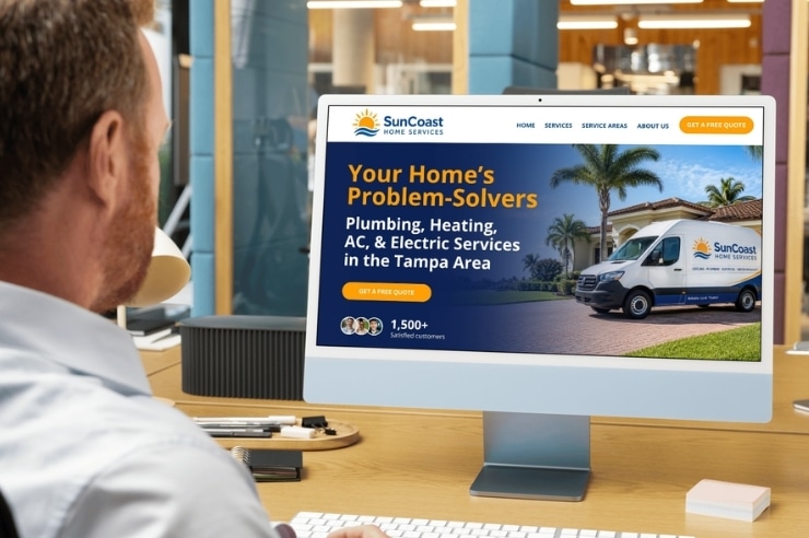
Top 10 Reasons Why Your Home Services Website Isn’t Cutting It
In 2026, homeowners don’t flip through the Yellow Pages or ask around the neighborhood before hiring a plumber,...
Read More
Best Ecommerce Platform for SEO in 2026: Shopify, WooCommerce, and WordPress Compared
Choosing the best ecommerce platform for SEO in 2026 is not just about picking the most popular option....
Read More
Marketing Attribution for High-Intent Leads in 2026: How to Track Calls, Forms, and Offline Sales Without Broken Data
If your company depends on quote requests, consultation calls, demo forms, booked meetings, or sales conversations that happen...
Read MoreOur Awards