Back when tablets and smartphones first created issues for designers, many developers and designers created web designs that required duplicate and triplicate coding. Some created websites specifically for the phone, and tablets never really seemed to work right with some layouts.
What a mess it all was!
Now, things are simplified. A responsive design ensures the user receives a satisfactory experience no matter what electronic they’re accessing your site with. When done correctly, the user doesn’t think about it — just the way it should be.
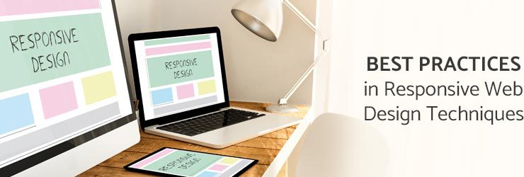
Best Responsive Website Design Techniques
These design techniques were written with the novice in mind. Responsive design and HTML5 take some getting used to but here are a few best practices that you can use to talk with your developers, designers, or agency that’s putting together your site design.
Color Differentiation

On large screens, it’s very easy to see different sections of a site and the eye can easily skim from one to the other. On smaller screens, color differentiation between sections helps the mind figure out where one section ends and one begins.
Font Choice

Again, on a big screen font readability is relegated to font size. Even a difficult-to-read font can become more legible if you make it large enough. On a smaller screen, you are limited by screen size on how large you can make your font before the only thing a visitor sees is one word. Select a font that is easy to read on any size platform, especially as Baby Boomers age. Your ideal customer demographic is important to remember in design as well.
Content Over Styling

For large logos, it is conceivable that when a large screen logo transfers onto a small screen that it doesn’t work with the layout of the content. If this happens, branding is important and needs to be present but not at the cost of content. In this case, the styling must fade into the background or take on another (similar form).
Know Your Audience
It’s critical to the success of your website roll-out that you communicate to the people working on your responsive design what’s most important to you and your customers. Some designers ditch text for large menu buttons when they move from a larger screen to a smaller one, while others keep text and diminish the importance of images and videos. It’s important to ensure your designers and developers understand your audience preferences as well as you do because there are occasional decisions that need to be made about the design that will require knowing what your customers prefer.
For the first time this year, mobile search has surpassed desktop search. If you don’t have a responsive design for your business or you’ve been considering a site redesign, it’s no longer the perfect time. That was six months ago. Now it is a necessity.
Related Posts

How To Set Up a Shopify Store
Creating a Shopify store is one of the best methods to establish or expand your eCommerce business. In...
Read More
Custom Logistics Website: Streamline Operations & Increase ROI
In the logistics industry, operational efficiency and cost savings are vital to achieving profitability. A custom logistics website...
Read More
Logistics Website Design: Essential Features for Business Success
The logistics industry is one of the most dynamic and fast-paced sectors today, where efficiency and real-time operations...
Read MoreOur Awards