As the owner of a digital agency, redesigning our website is probably the biggest pain in the ass for me. It has to be done and it has to be done frequently. In fact, I like it redesigned once a year. I know. It’s too often.
Before I jump into the challenge with this website, I want to share a little of the back story.
2012-14. We had a parallax website. It was okay, but it was the epitome of too many compromises. I hated it from day one. I wasn’t honest with our executive staff, and I felt that I could let it slide and live with it. Although we got compliments on it, I wasn’t thrilled with it and felt we could do better.
2014-15. We tried an experiment. Due to all the rage with website templates, we thought we could use one for our own site. Let’s be honest, there are some really badass website templates out there. But, just like with anything that’s templated, it’s hell to customize. But we customized it. Again, it was decent. But it was so slow due to all the junk code that templates have (bloated with unnecessary code), it was worthless.
Let’s Completely Overhaul Our Website
So in mid-2015, I decided it was time for a new site. Our SEO rankings were plummeting. And I mean plummeting. Google wasn’t even crawling 50% of our pages. Our blog post structure was outdated. And our site wasn’t the most user-friendly. And did I mention it was slow? I hate slow sites.
The plan was simple. We were going to change our value proposition, add a pricing page, and offer a simple website that explained who we are, why we do what we do, and how we do it. And I wanted this done in 60 days. Yes, I was that bad client no one wanted to deal with. The client that wants it now without planning everything through or looking at the available resources, my time included.
So we started like any other site. We put together a project plan. From the start, it was clear this wasn’t going to happen within 60 days. But I was optimistic, well, overly optimistic. The site took 6 months…and it’s still not done.
Back to the identity crisis. Changing your value proposition is not easy. We interviewed clients, looked at competitors, and decided that our value was something that was very difficult to compete with. It’s our non-stop, never give up, keep going and do whatever the hell it takes attitude. Or as we put it, genuine give a damn.
This process took longer than it should have. The reason is that it’s a shift in our communication. To make things worse, we were also trying to communicate our team as a marketing package. You see, we have a strong marketing process. We’re able to take on an account, create a discovery, build a strategy and execute a plan that achieves serious results. Our clients make a lot of money. So we thought the best way to communicate this was to put prices on our site with the packages that we offer. But we also had to communicate how we do this. Well, that’s a hell of a lot easier said than done. To distill a value proposition is an arduous task. It has to be brutally simple and communicate with absolute clarity what you do and who it’s for in a matter of seconds. I went back and forth for weeks with our lead copywriter. But we finally got it.
Key Changes to Key Terms
Now it’s time for the SEO and the copy. Since we settled on the new value proposition, we jumped right into SEO’ing our site. This was also a drastic change. We want to rank for digital marketing agency. We used to rank well for advertising agency and marketing agency-related terms. But at the end of the day, we’re a digital marketing agency. This change sounds easy enough, but it’s not. There’s a ton of research that’s involved. And after the research, you have your recommendations. And anytime you have things recommended to you, you have to make decisions and sacrifices. From the onset, I told the team I wanted the copy simple. We got there. But the sacrifices we had to make went against our traditional SEO process. We took page names out of the URLs and redirected them. We cut back on the copy so it was short, crisp, and to the point. Not a word more than needed. Eloquence in brevity as ole’ Shakespeare said.
But what to do with all of the old blog posts that were overly technical and driving the wrong kind of traffic? We deleted them. But that was a tough decision to make. We also had to change the structure of our blog. You see, we employed an old technique. All of our blog posts would fall after the homepage.
In any case, this meant that we would have to redirect 150+ blog posts, and this is after deleting some 100 blog posts. I was concerned. As any SEO worth his salt will tell you, massive redirects are always a scary thing. But we did it.
Let’s Design Something
By this point in the project, we’re at like 90 days. And mind you, we’re doing work for all of our clients and trying to squeeze our site in. We had two huge rush projects come in that decimated our timeline, but the project had to go on. It’s our site! Anyway, now we’re in the design stage. We have our goals, our sitemap, our user flows, wireframes, new copy, and everything we need to move forward.
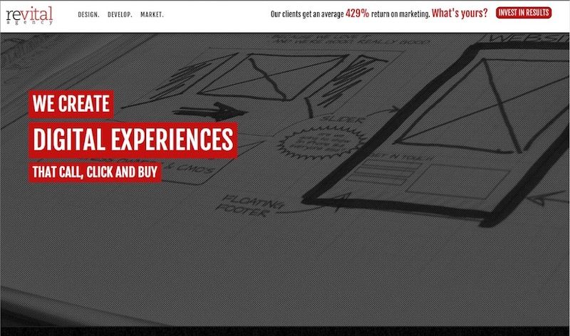
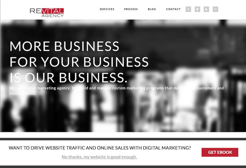
But now we have to redesign our style guide. We made changes to our buttons to increase conversions. We introduced a teal blue. Why blue? It’s a stark contrast from red and black so it stands out. They’re buttons after all. We want people to click on them. This process took another two weeks. Once we completed that, we started designing the site.
We started with the homepage. I wanted an image of the work we’ve done on a table, shown on three different devices: mobile phones, tablets, and desktops. We shot this photo every way from Sunday for another two weeks. I looked at 100+ edits and modifications. I was still unhappy, but I found one worth settling on. Did I mention that I hate settling? Anyway, we have the photo and we go into the design phases. We changed the layout substantially and started simplifying the user experience to match a beautiful interface. The iterations went on for weeks. Why? I messed up when trying something new. We tried having the wireframes and copy run in parallel. Meaning, we were working on two things that should have fell in sequential order. So when we’re adding the copy to the designs, nothing’s fitting. I mean nothing. This was brutal. But it turned out to be a good thing. It helped us slim down the copy even further, making a more crisp message. We finally jam everything into the designs, and we’re ready to code.
Programming and Still Designing
So the sites being coded. But I’m not totally satisfied with the copy. We made changes after all. And I’m not totally satisfied with the design because it’s not as simple as I would like. So I start changing things. And the reason I do this is because I have a design philosophy that #1, everything is design. From the copy and message all the way to the code. It’s all design. But like a design, it has to be sculpted like a sculpture. Shave a little here, add a little here, and shave a little more. Think Patrick Swazi and Demi More in Ghost. You get it. Well, this wreaks havoc on a team. You’re still tweaking and they’re trying to finish things. Tracking changes like this makes a copywriter crazy, a designer mad, and a programmer absolutely hate you. But nonetheless, it had to be done.
So the programming took another 3 weeks. Because even though I was making changes with the designer and copywriter, these changes were affecting forms, user flows, and all of the other mechanisms that we put in place to make a badass website. We have to do it right or don’t even do it. Then we started having issues with our tracking pixels. We have so many tracking tools on our site that it’s scary. We can see who comes and goes, how long they’re there, what they do, and so on. But all this stuff has to be set up right or the site gets bogged down, and it’s slow as hell. Some of the tools weren’t playing nice with one another, so we had to debug and get all the kinks out.
Okay. So now we have everything ready to go. The programming is pretty much done. And now I hate the picture. I want a video. I like videos. It shows action and movement. So we get a video. This took another week. It has to be the right size or it’s going to be slow. It has to fit the text and so on. I got my video. Now we’re ready to launch.
The site launches. It’s been a month. Am I happy? No, not yet. But I’m getting there. This is only phase one of a four-phase build. We determined a long time ago that trying to build the latest and greatest website prior to launching is a terrible idea. They take way too long. By the time you actually get remotely satisfied, technology has eclipsed what you originally set out to do. So to sum it up, I’ll think I’ll be happy in phase 2.
Conclusion
The site was a brutal test of tolerance on account of my lack of patience. I learned that I couldn’t be that type of client. You have to plan accordingly and have realistic expectations. This includes my time as well as my team’s capacity. I also learned that although there are benefits to running certain tasks in parallel to one another, it’s best to stick to the original game plan and let them fall in sequential order.
Related Posts

How To Set Up a Shopify Store
Creating a Shopify store is one of the best methods to establish or expand your eCommerce business. In...
Read More
Custom Logistics Website: Streamline Operations & Increase ROI
In the logistics industry, operational efficiency and cost savings are vital to achieving profitability. A custom logistics website...
Read More
Logistics Website Design: Essential Features for Business Success
The logistics industry is one of the most dynamic and fast-paced sectors today, where efficiency and real-time operations...
Read MoreOur Awards